Have you ever stopped to think about why online slot games look the way they do? The visual presentation of slot gaming platforms goes far beyond simple aesthetics. Every color choice, animation, and design element serves a specific purpose in shaping how players interact with these games. Understanding the visual dynamics behind these platforms reveals a fascinating intersection of psychology, technology, and creative design.
The visual appeal of online slots is carefully constructed through multiple layers of design thinking. From the moment a player opens an application or website, they encounter a carefully orchestrated visual experience. This experience isn’t random or accidental. Instead, it’s the result of extensive research, testing, and refinement by design teams who understand how humans perceive and respond to visual stimuli.
The graphics and animations in modern slot platforms have evolved dramatically over the past decade. What started as simple, pixelated images has transformed into highly detailed, three-dimensional environments that rival video game production quality. This evolution reflects both technological advances and a deeper understanding of what keeps players interested and engaged.
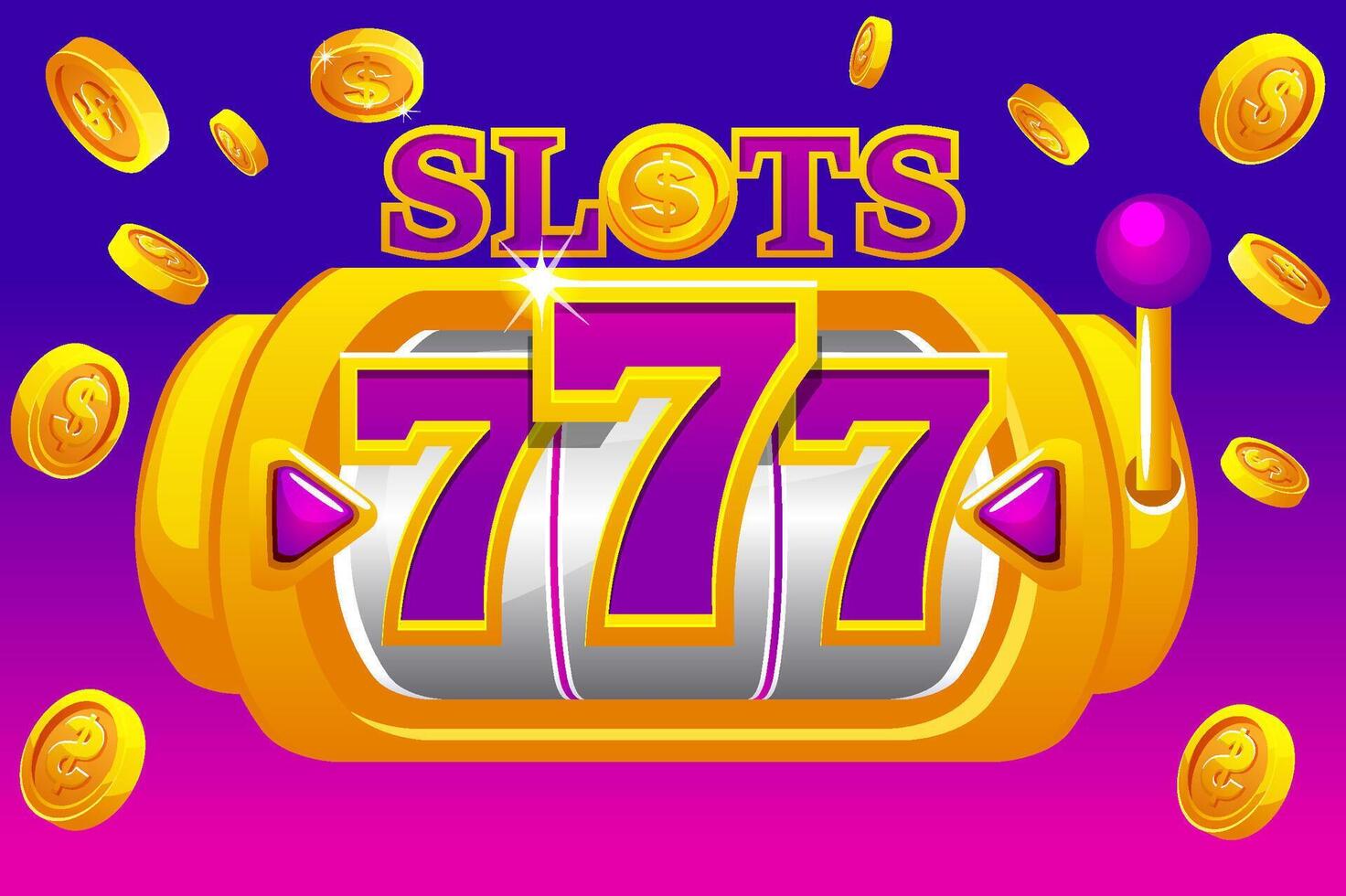
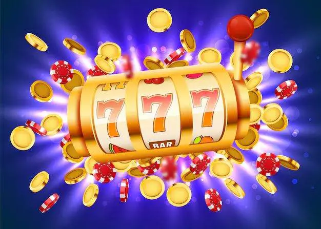
Color Psychology In Slot Design
Colors play an enormous role in how players feel when they’re using slot platforms.
Bright, warm colors like gold and orange are commonly used in slot game design because they trigger feelings of excitement and optimism. These colors naturally draw the eye and create a sense of energy that matches the fast-paced nature of slot gameplay. Red is another popular choice, as it creates urgency and grabs attention immediately. Cooler colors like blue and purple are often used in background elements to provide balance and prevent visual fatigue.
The contrast between colors matters just as much as the colors themselves. Designers use high contrast to make important elements stand out. Winning combinations, bonus features, and call-to-action buttons are typically highlighted using colors that pop against the background. This strategic use of contrast helps guide players’ attention to where the action is happening.
Different platforms employ different color schemes based on their target audience and theme. A slot game themed around ancient Egypt might use golds and deep blues, while a modern tech-themed game might incorporate neon colors and sleek grays. The color palette becomes part of the overall storytelling experience.
Animation And Movement Effects
Movement is one of the most powerful tools in slot platform design.
The spinning reels themselves are the foundation of slot animation. The speed of the spin, the way symbols slow down, and the bounce effect when they land all contribute to the tension and satisfaction players feel. Modern platforms use variable animation speeds to create drama. A slower spin can build anticipation, while a quick spin delivers instant gratification. Winning combinations trigger additional animations like flashing lights, symbol expansions, or particle effects that celebrate the win.
Beyond the reels, animations guide players through their entire experience. Buttons light up when you hover over them. Menus slide in smoothly. Bonus rounds transition with cinematic flair. These micro-animations serve a practical purpose by making the interface feel responsive and alive, but they also add to the overall entertainment value. When players interact with a platform that responds with smooth, polished animations, it feels more premium and trustworthy.
The timing of animations is critical. If animations are too slow, they feel sluggish and frustrating. If they’re too fast, they become confusing. Professional slot platforms spend considerable time fine-tuning animation speeds to hit that sweet spot where everything feels responsive but not rushed.
Typography And Text Presentation
How text appears on screen influences readability and emotional response.
Slot platforms use bold, large fonts for important information like win amounts and game titles. This ensures players can quickly understand what’s happening without straining to read small text. The font choices themselves matter too. Serif fonts feel traditional and classic, while sans-serif fonts feel modern and clean. Many platforms mix font styles strategically, using decorative fonts for titles and simple fonts for functional text.
Text color and background contrast are essential for accessibility. White text on dark backgrounds or vice versa creates high contrast that’s easy to read. Some platforms use text outlines or shadows to make text pop off the background. This attention to readability shows respect for players’ experience and ensures nothing gets lost in translation.
Symbol Design And Thematic Elements
The symbols themselves are visual storytellers in slot games.
Each symbol is designed to be instantly recognizable and visually distinct from others. High-value symbols are typically more ornate and detailed, while low-value symbols are simpler. This visual hierarchy helps players quickly assess their results. Thematic symbols tie into the game’s overall story. A pirate-themed slot will feature treasure chests, ships, and maps rather than generic geometric shapes.
Modern slot platforms use detailed artwork and shading to make symbols look three-dimensional and tangible. The quality of symbol design has become a major differentiator between platforms. Players often gravitate toward games with superior artwork and creative symbol designs. When you can find platforms like hoki22.com, you’ll notice how much attention goes into making each symbol visually appealing and thematically appropriate.
User Interface Layout And Visual Hierarchy
How elements are arranged on screen determines how easily players navigate the experience.
The main game area typically occupies the center of the screen, drawing focus naturally. Control buttons are positioned within easy reach, usually at the bottom or sides. Information like balance, bet amount, and paylines is displayed in corners where it’s visible but not intrusive. This layout respects the player’s attention and keeps the focus on gameplay.
Visual hierarchy is created through size, color, and positioning. Larger elements feel more important. Brighter colors draw attention first. Elements positioned in the center of the screen feel more significant than those in corners. Professional platforms use these principles consistently so players always know where to look for what they need.
Responsive Design Across Devices
Visual dynamics must adapt to different screen sizes and devices.
Mobile screens require different visual approaches than desktop displays. Buttons need to be larger for touch interaction. Text needs to be more concise to fit smaller screens. Colors need to remain vibrant on various screen types. Platforms that excel visually do so across all devices, maintaining consistent quality whether players access them on phones, tablets, or computers. This requires thoughtful design choices that prioritize clarity and usability on every platform.